Website redesign for nonprofit agency
> UX research, UX writing, information architecture
A local nonprofit provides services, meals, and clothing for homeless and low-income neighbors. They wanted to overhaul their outdated website to better align with their vision and philosophy. I was a volunteer content consultant and project manager working with staff and external designers.
Visioning process
The visioning process with staff and board members informed every step of the redesign process. Discussing vision and philosophy gave us a good picture of stakeholder concerns, volunteer motivations and attitudes, and day-to-day staff challenges.
The visioning process with staff and board members informed every step of the redesign process. Discussing vision and philosophy gave us a good picture of stakeholder concerns, volunteer motivations and attitudes, and day-to-day staff challenges.
Project planning
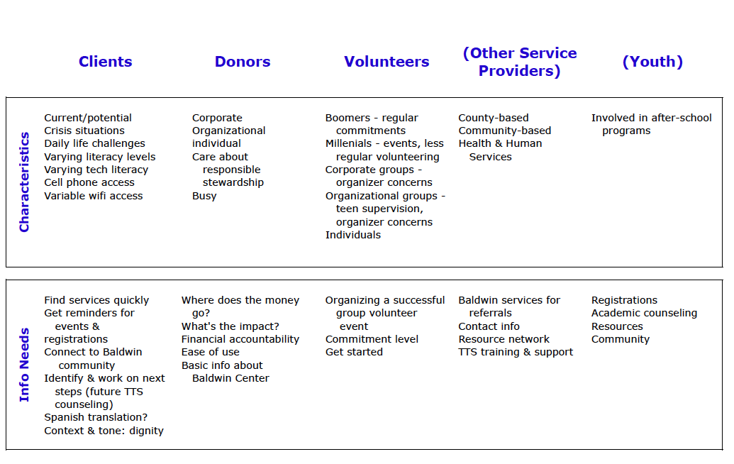
We outlined use scenarios and site goals for three very different audiences--clients, donors, and volunteers--as well as plans for future expansion.
We outlined use scenarios and site goals for three very different audiences--clients, donors, and volunteers--as well as plans for future expansion.
Content inventory
We collected, organized, and updated existing digital and print content across the organization.
We collected, organized, and updated existing digital and print content across the organization.
User interviews
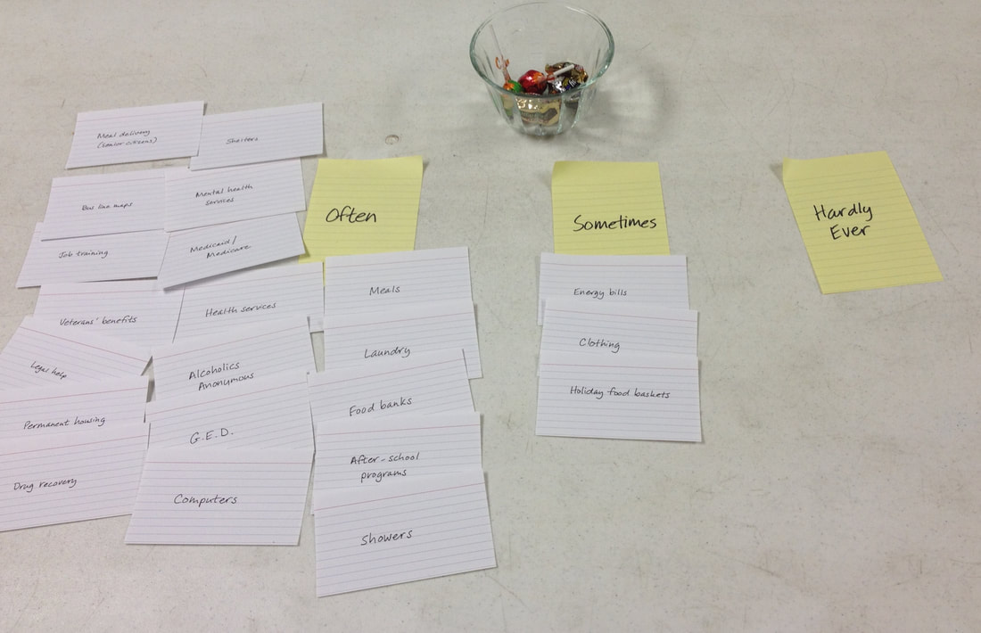
To learn about clients' day-to-day information needs and obstacles, we drew on staff experience as well as conversation and card sorting exercises with soup kitchen clients.
To learn about clients' day-to-day information needs and obstacles, we drew on staff experience as well as conversation and card sorting exercises with soup kitchen clients.
Architecture
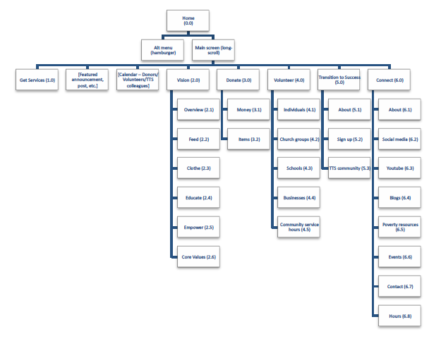
Blueprints organized the information the organization wanted to communicate. This structure was reflected in the hamburger menu, while the main interface addressed the needs of each group of users.
Blueprints organized the information the organization wanted to communicate. This structure was reflected in the hamburger menu, while the main interface addressed the needs of each group of users.
UX writing
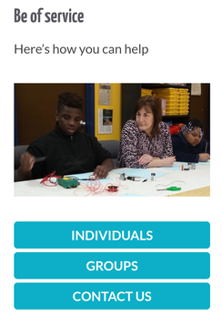
The site is used by people from across the socioeconomic spectrum. In keeping with the organization's guiding principles, we used language and tone that treats the diverse users as one community. Main headings were "Be supported," "Be of service," and "Be generous."
The site is used by people from across the socioeconomic spectrum. In keeping with the organization's guiding principles, we used language and tone that treats the diverse users as one community. Main headings were "Be supported," "Be of service," and "Be generous."
Collaboration with designers
We worked closely with the web design team to translate the architecture into a simple, responsive design.
We worked closely with the web design team to translate the architecture into a simple, responsive design.
Content strategy
Content creation is a particular challenge when it's spread among busy staff, interns, and volunteers, and spans multiple channels. We proposed content strategy practices to make the process easier and to make sure new content aligns with the organization's vision.
Content creation is a particular challenge when it's spread among busy staff, interns, and volunteers, and spans multiple channels. We proposed content strategy practices to make the process easier and to make sure new content aligns with the organization's vision.